
If you follow my blog regularly, you know by now that I'm a planner. So, of course, when I prepare for a new project, I tend to spend some time on the planning. Once the room was fully skimmed by a professional my ideas were just flying all over the place, and they all just waited to be put on a piece of board to set the tone of our newly refurbished dining room. I was continually bookmarking designs and compile boards of inspiring works on Pinterest. I gathered all my ideas that I had in my mind and inspirations from Pinterest on a piece of paper. I literally had about six different colour schemes in my head. Writing, writing and just writing.
Then scrapped it all out and finally narrowed them down to two colours.


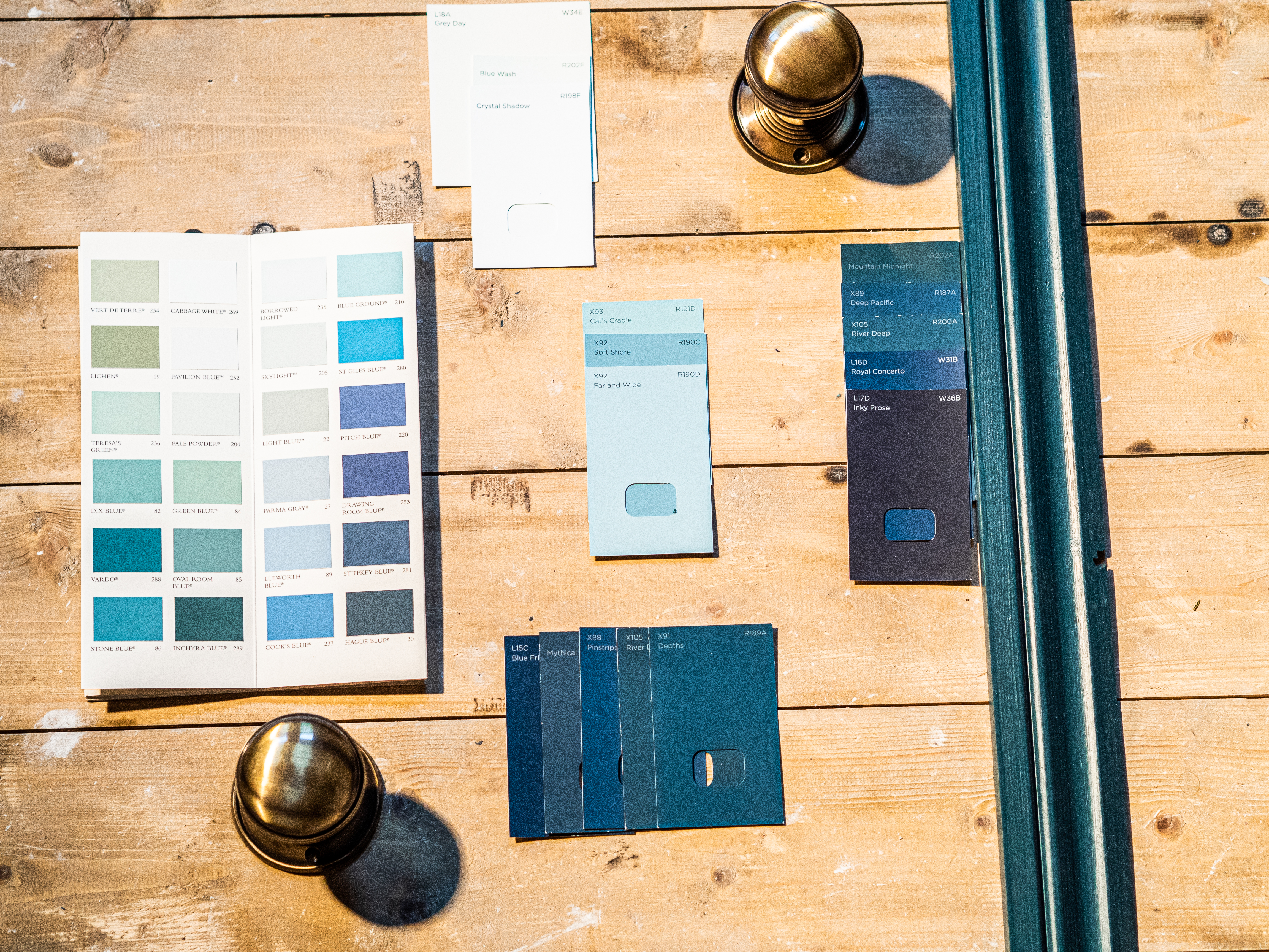
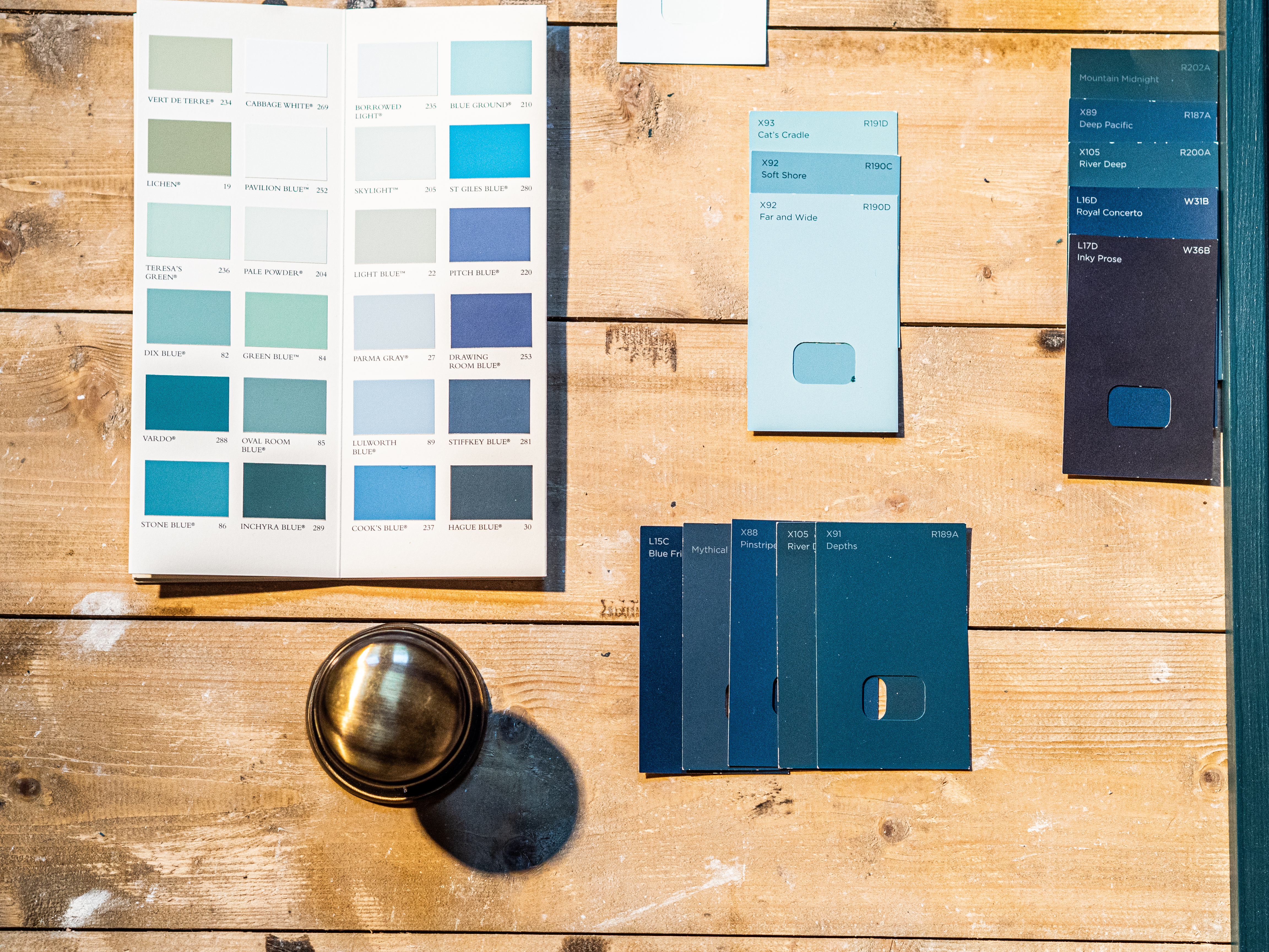
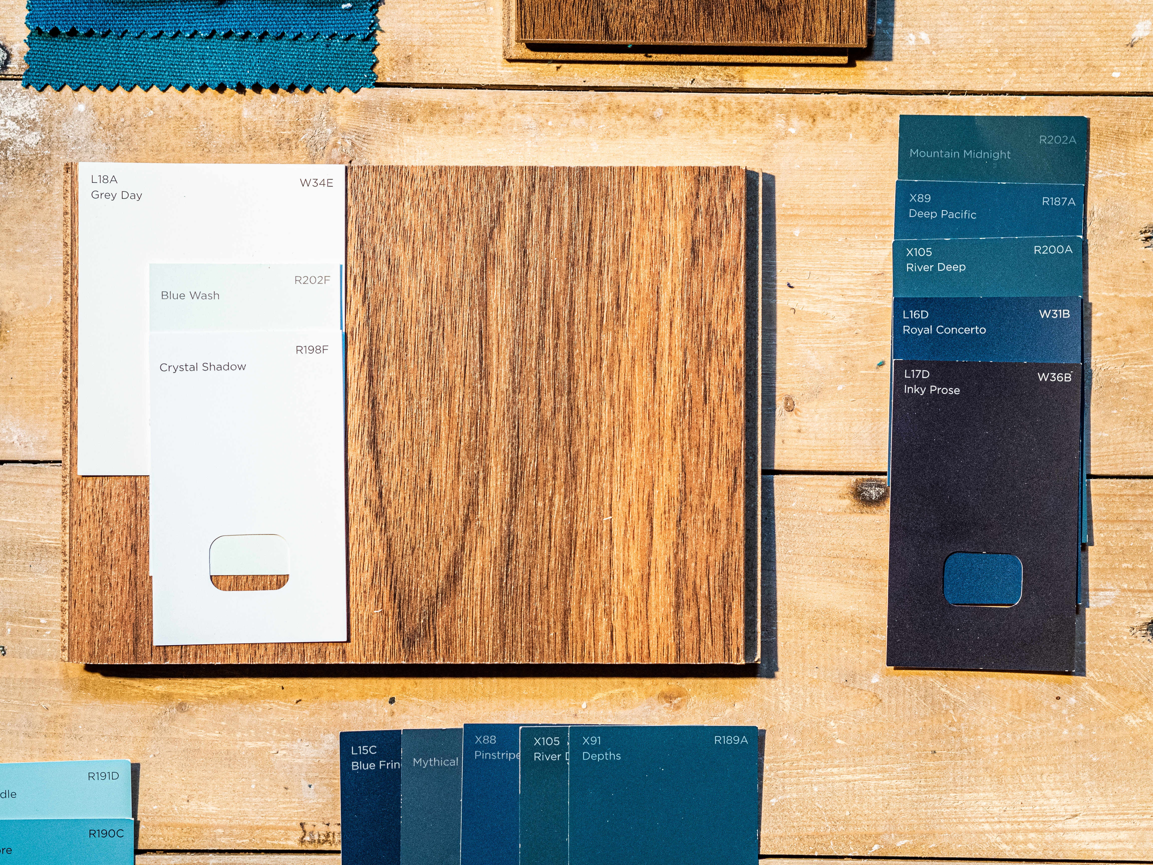
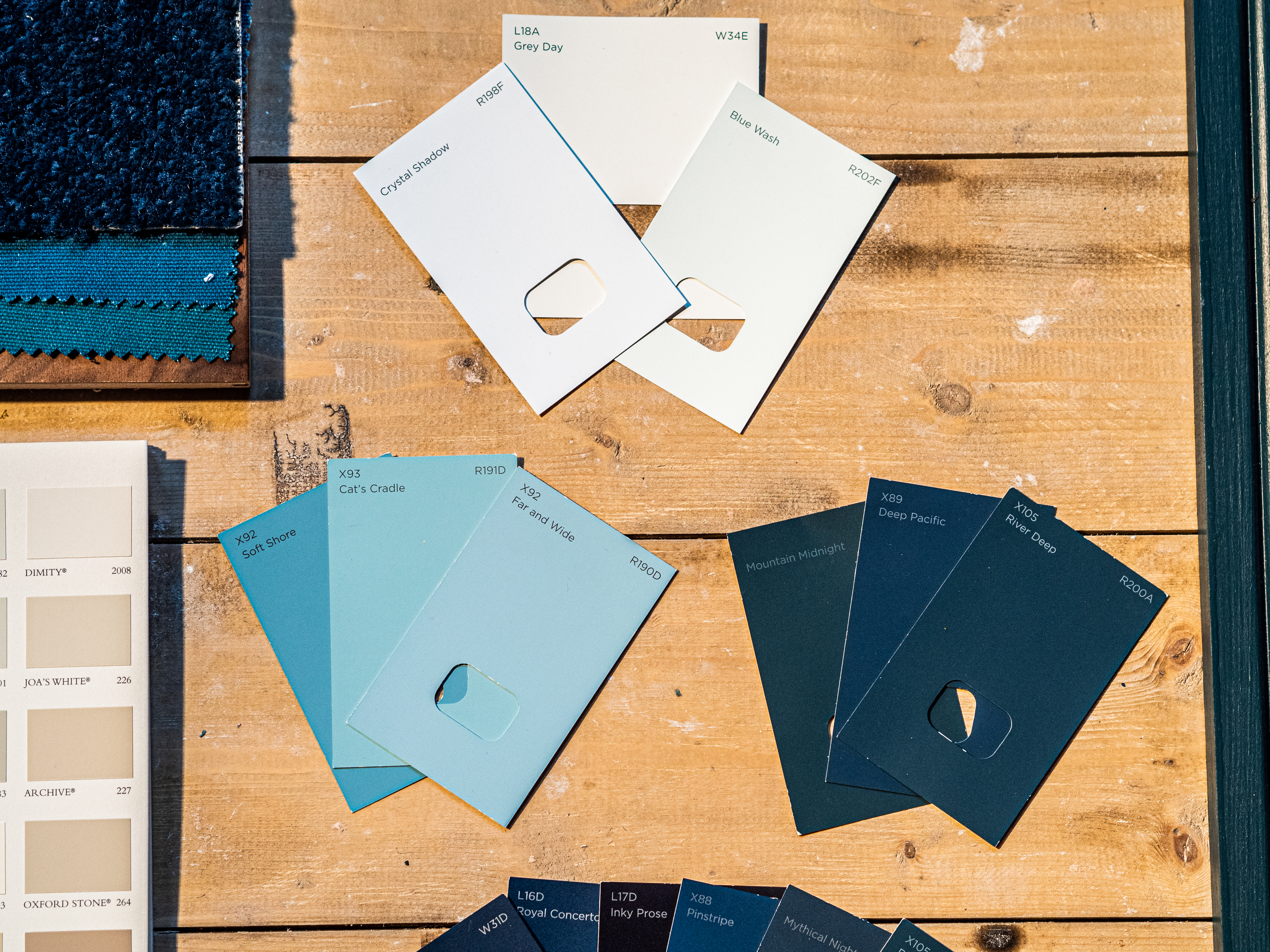
Choosing the base colour of this room was the hardest step of all.
I can't tell you how long it took Carl and me to pick the colour for us.
He wanted blue since day one, no shade in mind just the colour but I was so tempted to try out the green, but then I realised that going with blue might be a bit more sense as we haven't got a door between the kitchen and the dining room. We have charcoal units from Wren in the kitchen with a hint of blue here and there so by connecting the two rooms, the blue was the right choice for us.

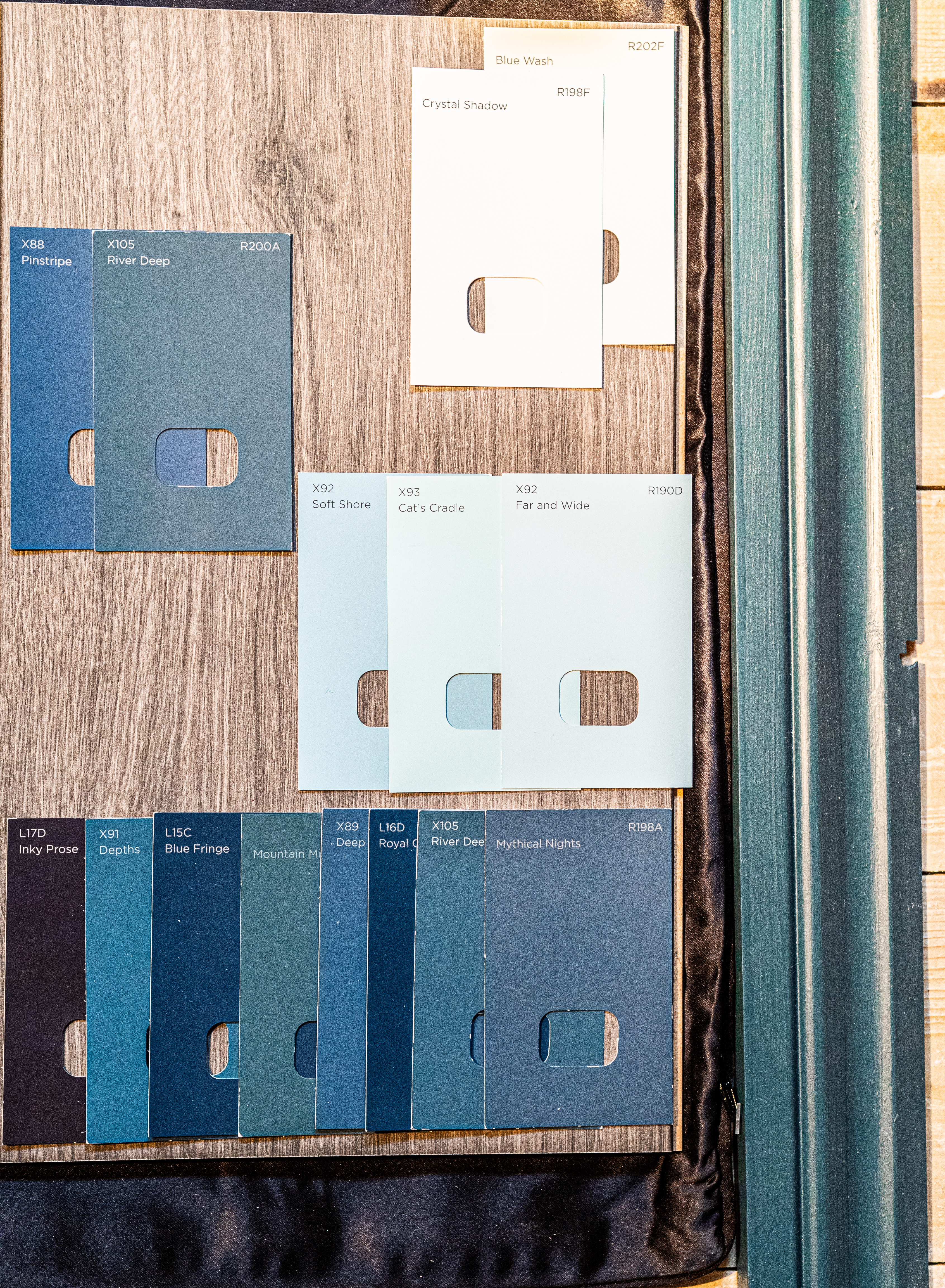

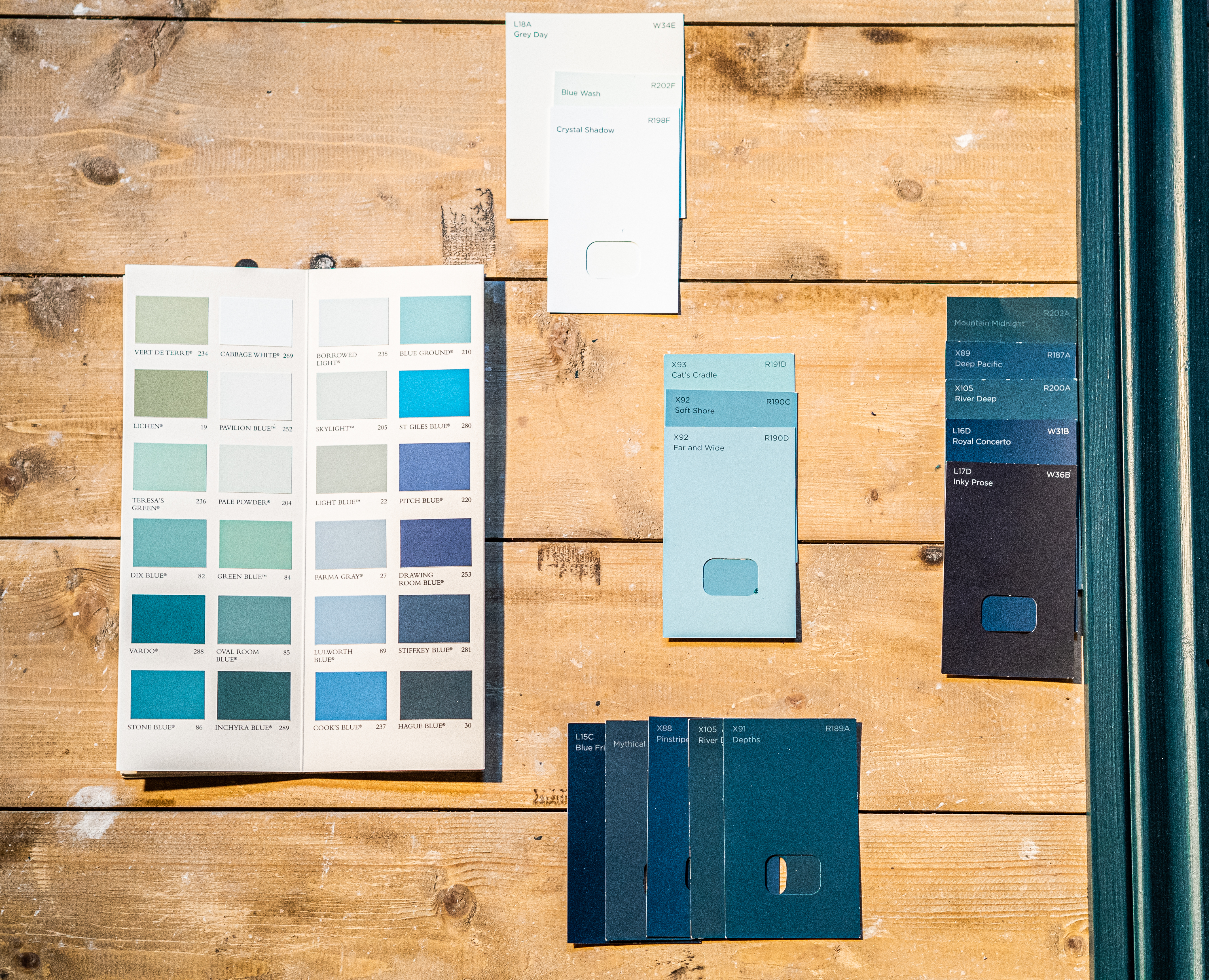
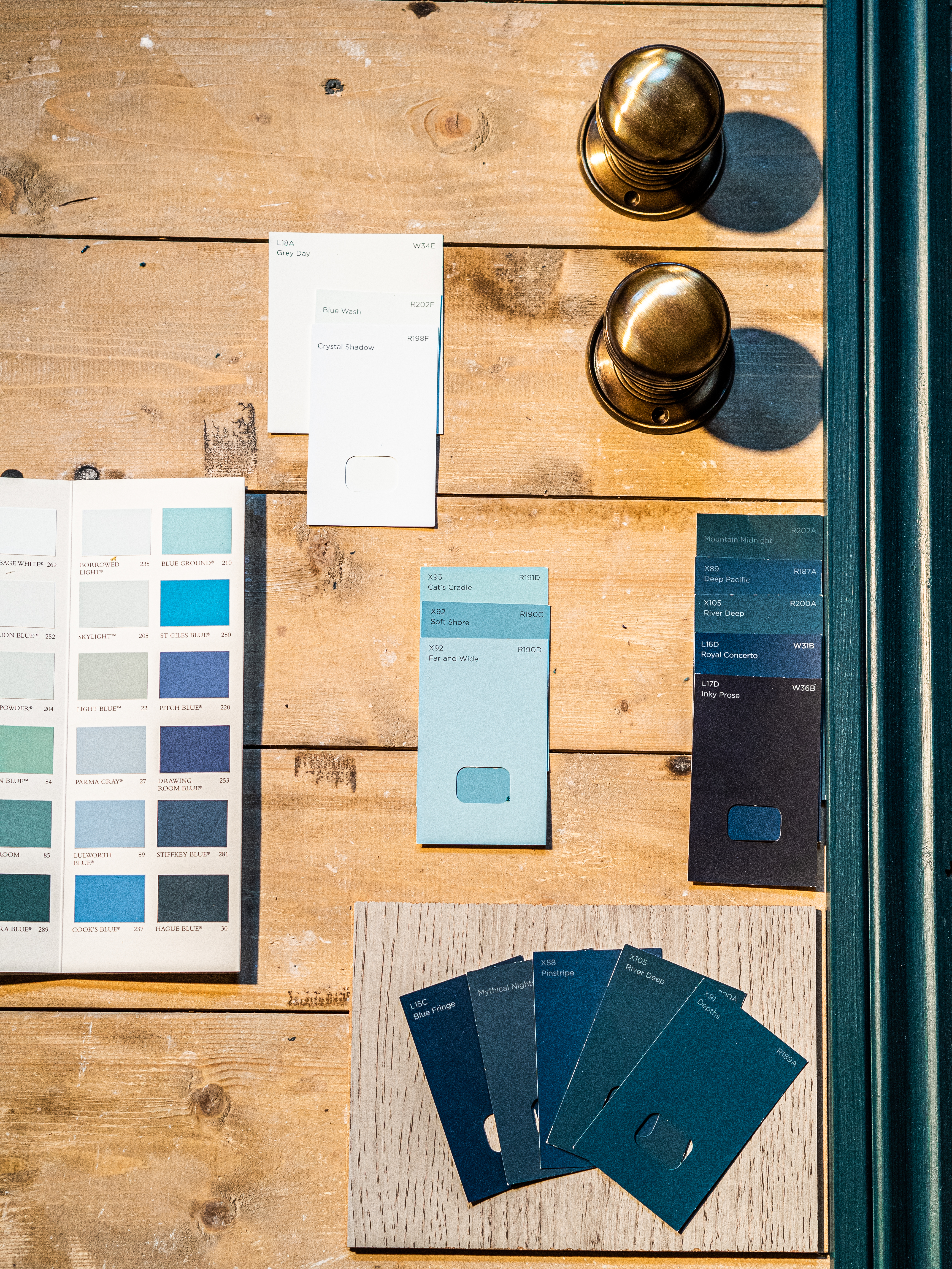
Once we finally made peace with a colour, we just had to pick the perfect shade.
The decision of which blue we will go with was all down to me. Carl agreed that it's much easier for me to pick. Plus he doesn't enjoy the interior design that much.
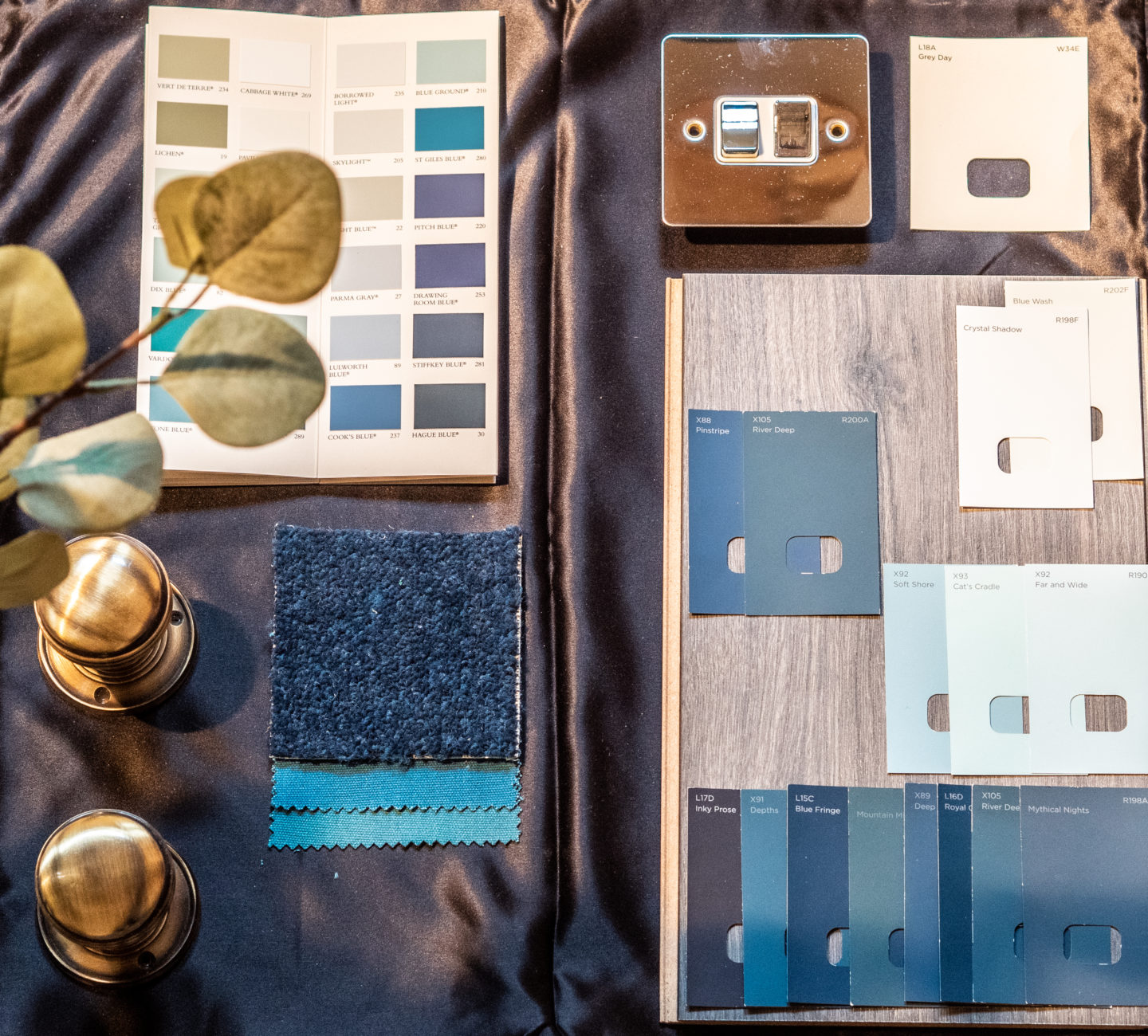
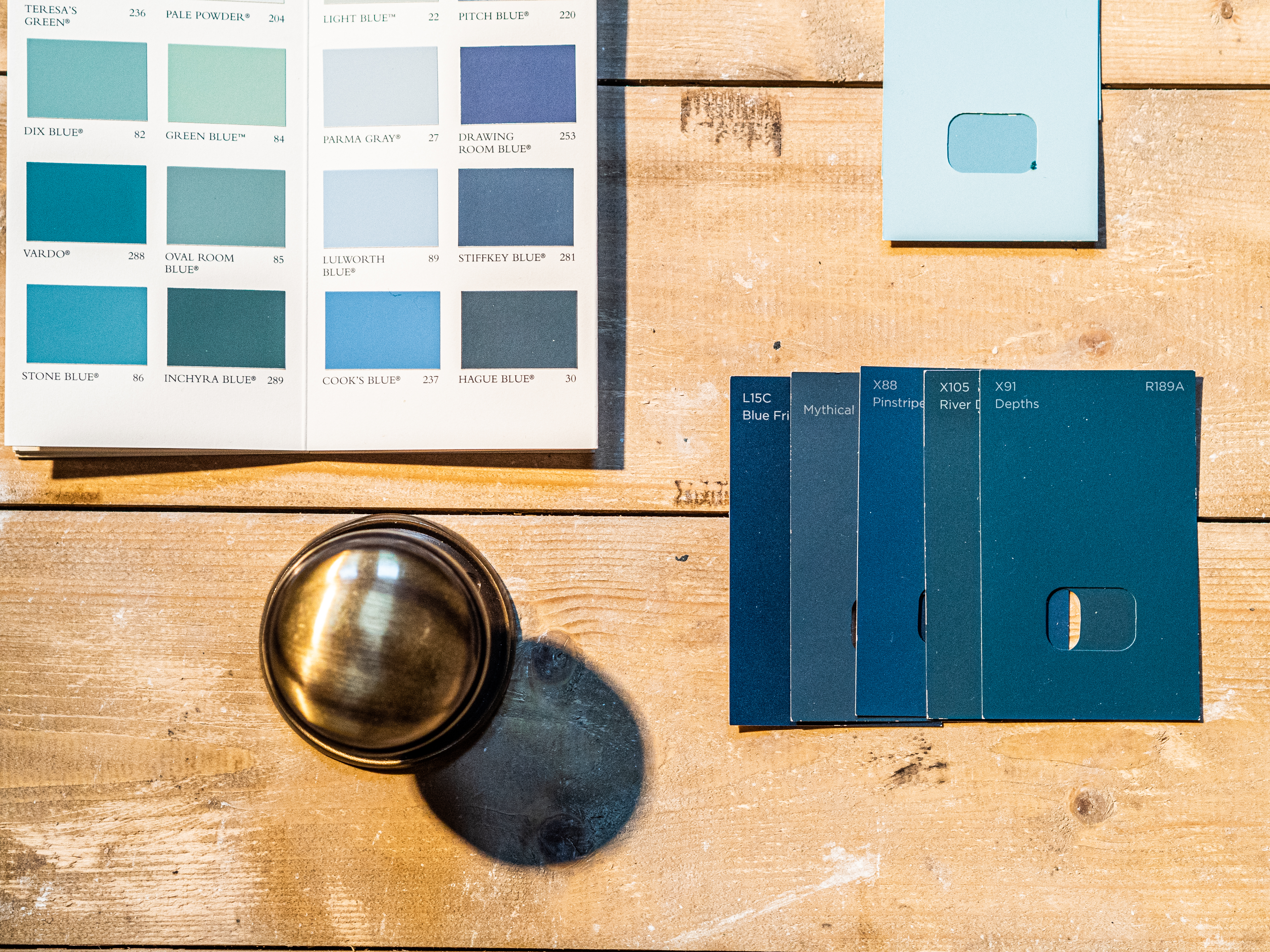
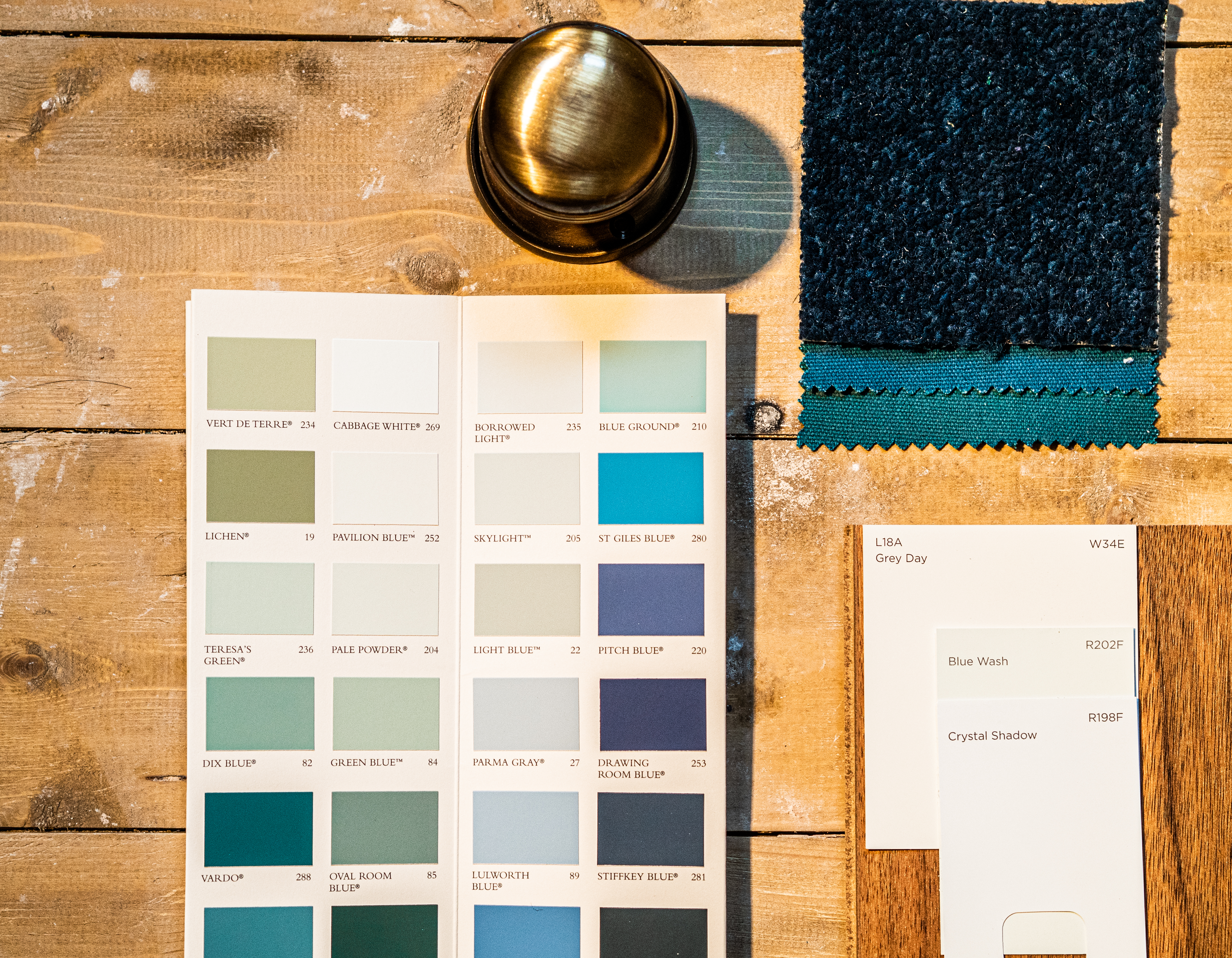
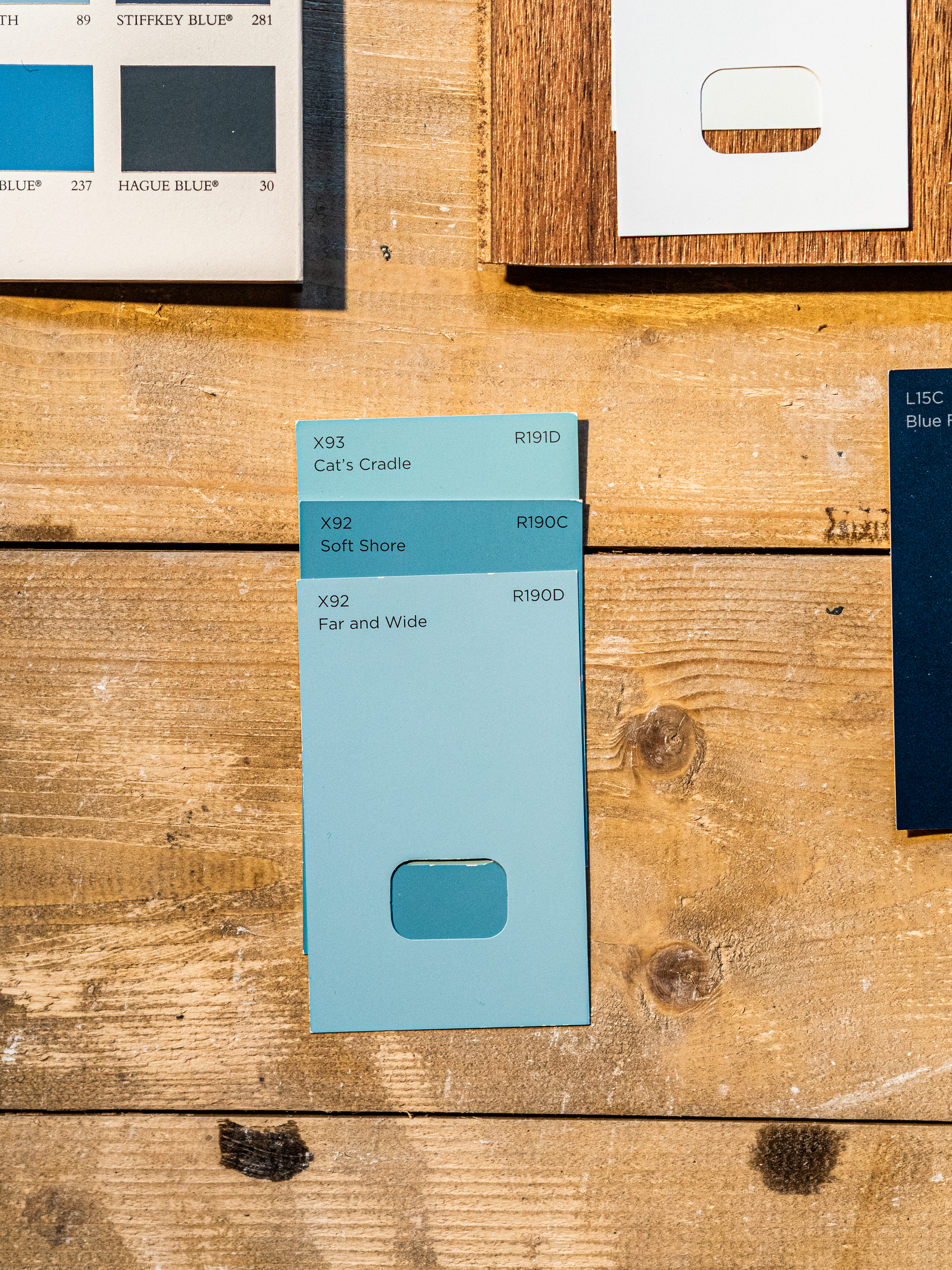
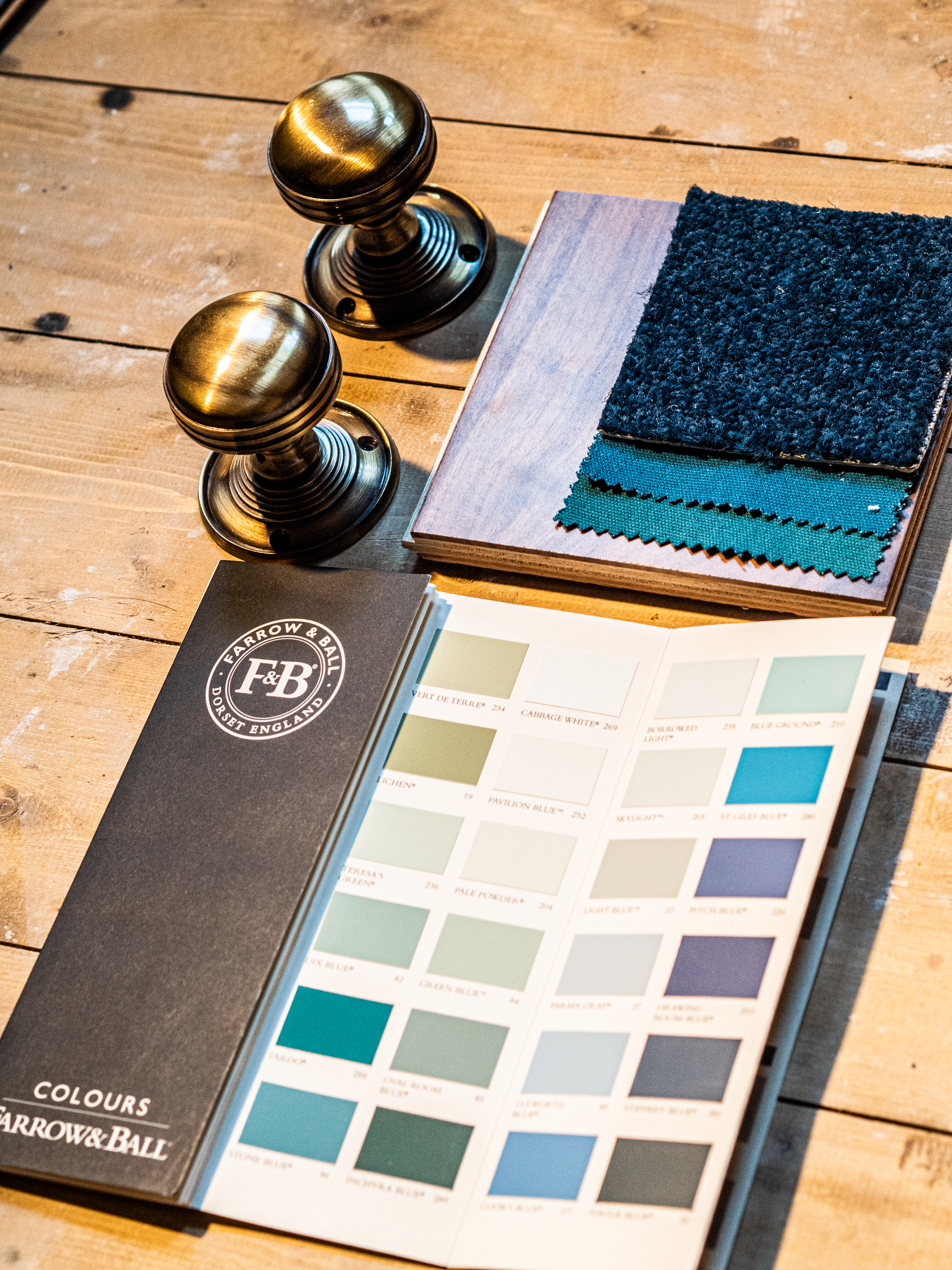
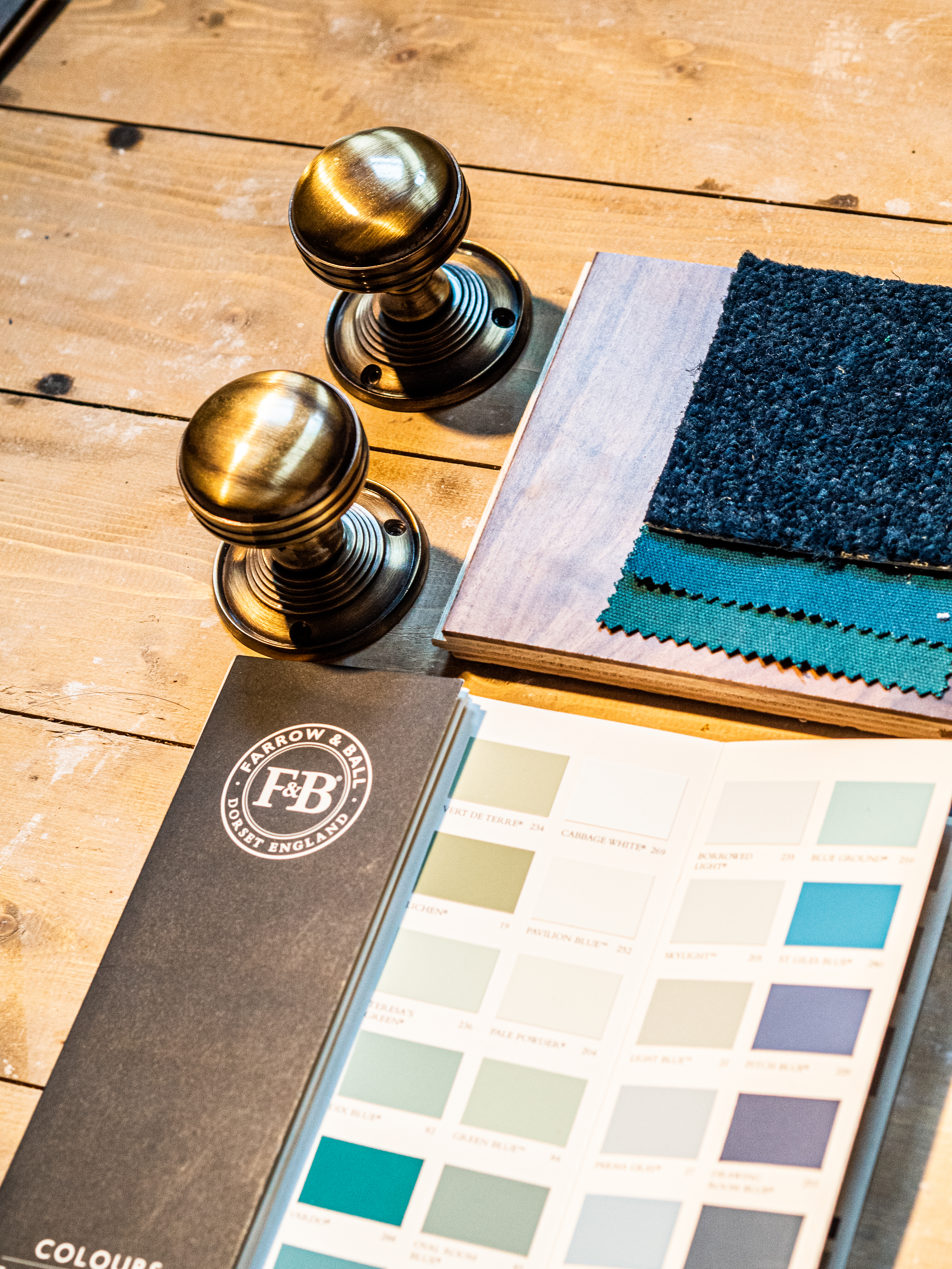
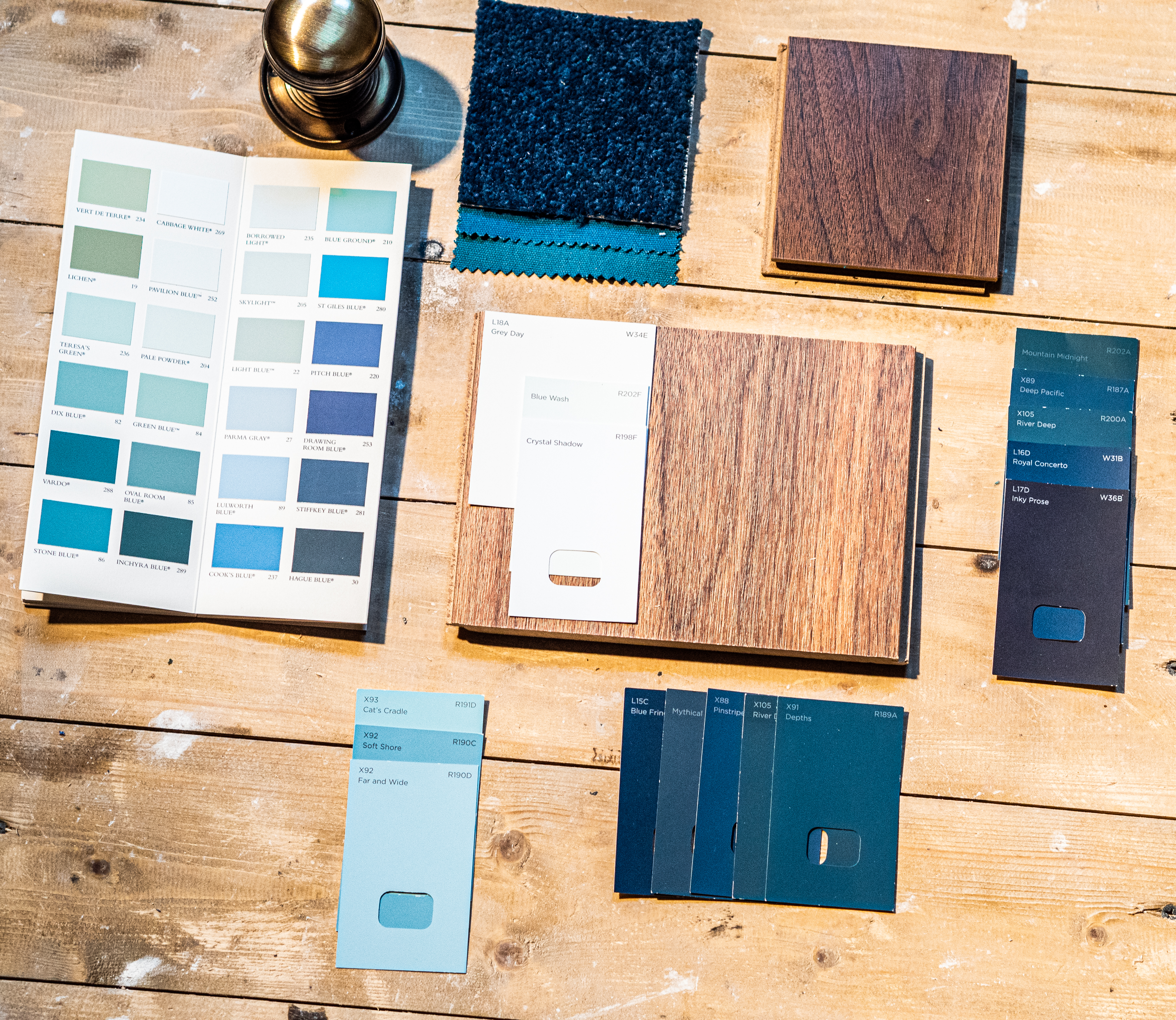
Before I even started to look around for a shade of blue, I was looking for a reliable and good paint brand. I found Valspar at a B&Q store. I found so many good reviews online, so I decided to give them a go. A big plus, they offer a mixing service, they literally can make any colour that you wish.
I wanted to start by picking the shade for the largest area of the room, the walls. This was my starting point to set the tone for the rest of the dining room. I picked a hint of grey in blue.
Followed by a midnight blue for the door and frame between the dining room and the laundry room.
To match the door with the windows, I picked the same colour for both windows and frames.
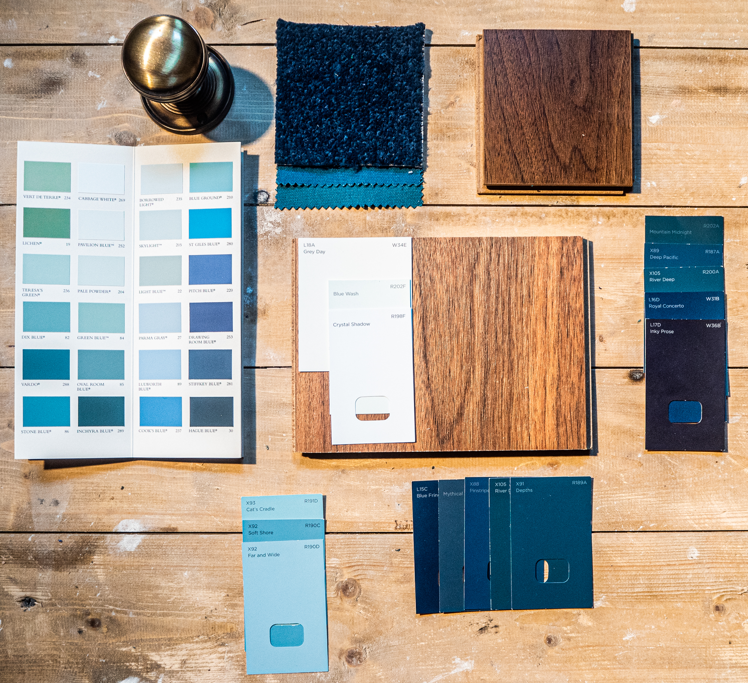

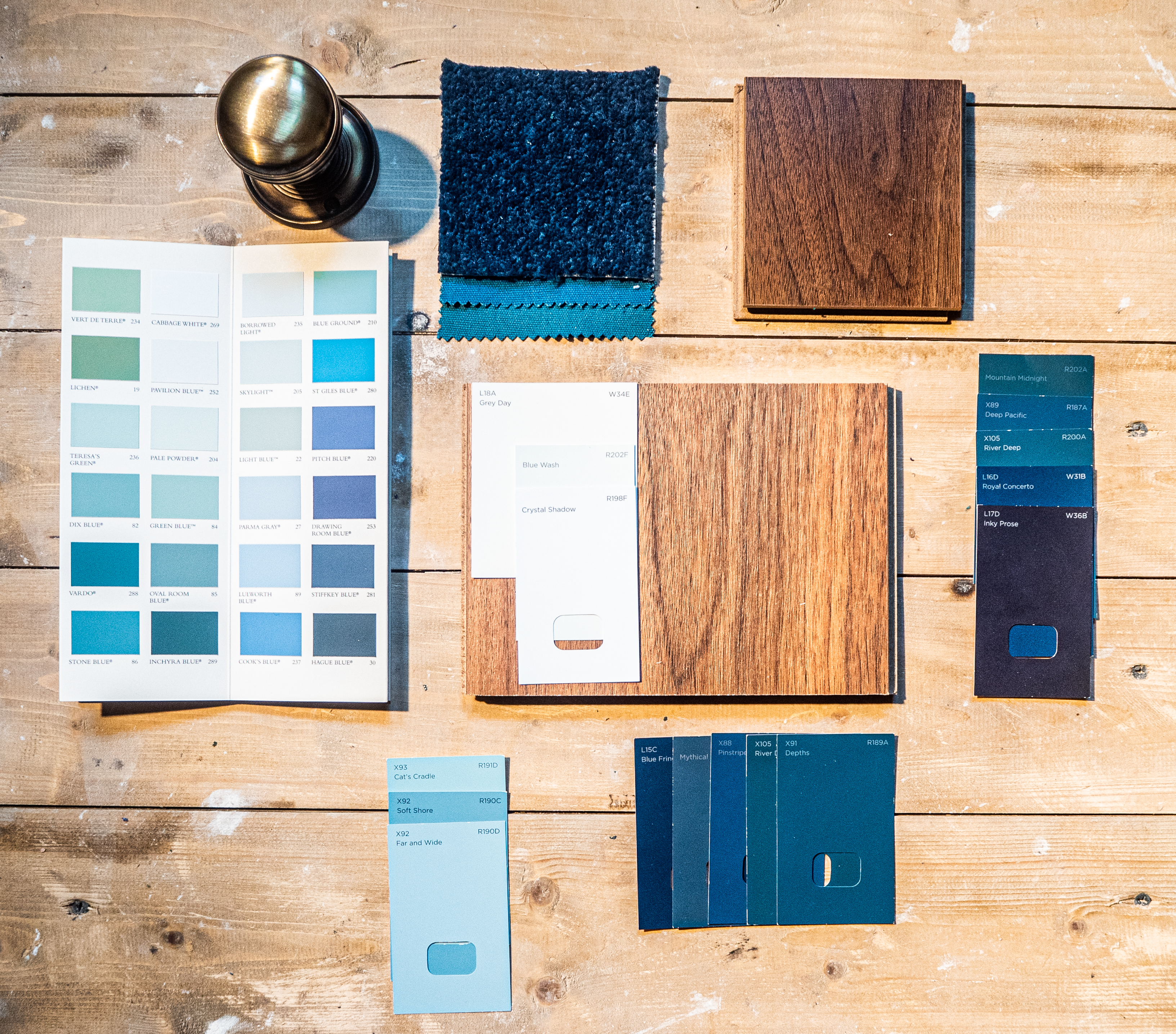
The second area was to consider is the flooring. We fitted wooden flooring from Wickes that only required a small amount of sanding and oiling. I just needed to find the right shade. As I mentioned above, I was so tempted by the green I bought straight away a hard wax from Fiddes in walnut. Well, that wasn't the right shade since I changed my ideas for blue, so I ordered another one in Smoked Oak. No panic as I set my mind on the green with walnut for the guestroom.

No secret that I love the Victorian era, the decorative ironworks, pointed arch doors and windows with rich dark colours create a warm and romantic feeling.
Next to the drama, I also love the Edwardian decor, which moves away from the dark and heavily patterned rooms and instead choose cleaner, more neutral colours.
But what I learned so far from decorating our home is that you cannot pick a style in advance, it's all down of the layout of the room.
Like when we refurbished our kitchen, I knew that place wouldn't be anything like the rest of the house. We wanted a big American rustic farmhouse kitchen with an elegant touch so it won't stand out too much from the rest of the house. First, I wanted to bring dark colours in the room, and as it's quite a big sized room, so I thought why not. Let's go for it, yet again there were other things to consider. We don't have a window in this room, only a french double door which doesn't give enough natural light to go with a rich dark colour scheme, so I went cleaner on the walls. Pure white, but to keep the drama, we picked charcoal units from Wren.
During our recent project in the dining room, I wanted to twist the old English decor with a bit of french Haussmann style.
In my latest blog, I shared our DIY wall panelling step-by-step process, click here to read it.
Once the panels were attached to the wall, it gave the exact style that I was going for. I wanted the panels to blend in, so I painted them with the same colour as the wall. From here, the only thing I have left to consider is keeping the elegant tone by accessorising with the right details and touches.


Colour palates and all the various combination I plan to use will create a sort of mood for this room. These will set the tone for the decorating scheme. It's an important decision to decide if I go with a dramatic contrast or just a few steps away from my base colour.
This is why I like to play around with my options while using a mood board. Layer up the board with swatches, scraps, and all different shade of my base colour scheme.
I tend to add some elegant details to the room with some antique gold.
The furnishing will be kept simple, the materials of the chairs and the curtains are still in process.


Hope to share the finishing process with you all. Sign up to my newsletters to keep you updated on any new posts.
See you next time,


